
Useful Things
Well Begun Is Nearly Done: Desktop publishing workflow at warp speed
Presented at the 32nd annual Editors' Association of Canada conference, Vancouver, May 29, 2011
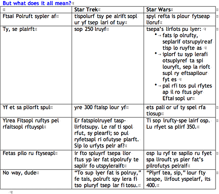
It’s a long time ago, in a galaxy far, far away. The three humans, two droids, and one wookiee on the Millennium Falcon are being attacked by Imperial cruisers. They can escape by jumping into hyperspace. But the pilot, Han Solo, is taking time getting coordinates from the navi-computer. As laser blasts hit, Luke Skywalker shouts, “Are you kidding? At the rate they’re gaining...”
And Solo replies, “Traveling through hyperspace isn’t like dusting crops, boy! Without precise calculations we could fly right through a star or bounce too close to a supernova and that’d end your trip real quick, wouldn’t it?”
It’s this week, in an office all too close to home. A project is on a tight deadline. You have the workflow and the people lined up, but you’re taking time making sure that everything is set up the right way in the layout... and the source file... As the telephone is ringing off its hook, your project manager shouts, “Are you kidding? We don’t have time for niceties like that! Just make it happen!”
And you reply, “Desktop publishing isn’t like using a typewriter. Without setting it up the right way, we could get nailed and waste hours redoing everything when the client wants to change some element of the look late in the game. And you know they will. And that would take us way over time and budget, wouldn’t it?”
You’ve probably heard your mother or teacher or some similar person say, “Well begun is half done.”
Well, when it comes to desktop publishing, well begun is really a lot more than half done.
Well begun is nearly done.
If you get your documents set up the right way from the start – your Word document and your layout file (in InDesign or whatever) – much of the actual layout can follow like the jump to hyperspace. The stars turn into streaks and you’re off to a new planet. And the other real time saver is when you have to make changes later on. If you have it all set up right, you can save a lot of time.
It’s a matter of precise calculations. Sure. No, actually, it’s something more and other. This is no question of application of brute force.
Use the styles, Luke.
Yes, that’s right. Styles are your number one friend. Styles are your hyperspace engine. Oh, there are other things you’ll need – you’ll need to set up master pages, too, and anchors often help, and if things haven’t been handled the right way you may need to do course corrections in the form of change-alls, and I’ll tell you about all those things – but above all, even in space, where no one can hear you scream, you still need styles.
I’m going to start by describing the optimal workflow, the one that will make everything flow almost like magic. This is a workflow I get to use when I’m working with someone who is likewise strong in the style, especially if that someone is me. After I tell you about this, I will tell you about what to do when you’re doing the layout but the source document has passed through many hands and is a mess.
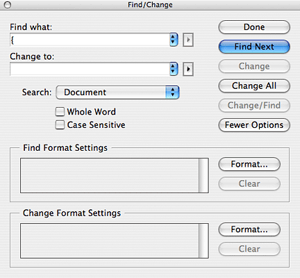
When I’m talking about the layout part of the process, I’m going to talk about Adobe InDesign. It’s really the top dog of the software out there now. Not everyone has the same version, of course. I have two versions: CS2 on my Mac at home, and CS4 on my PC at work. This doesn’t make all that much difference for what I’m talking about, except for when I come to the change-alls. What I’m saying about InDesign can generally be transferred to any other layout program worth using. Although, really, I’m not sure any other layout program is worth using...
But the text production part of the process, what goes on before the text goes into layout, is typically done using... something else. Most often, it’s something... dark.
[to the tune of Imperial Death March] Dum-dum-dum, dum-da-dum, dum-da-dum, Yes, that’s right, it is Microsoft Word...
Look, think of it this way. When the text goes from MS Word to Adobe InDesign, it’s kinda like Darth Vader coming back to the good side of the force.
It all begins, after all, not really with MS Word. It begins with a text, a string of words expressing ideas in a certain way. They just happen to be set out in MS Word more often than not. But what you will need to look at first is the structure of that text. Because you’re going to need to make a list of the different kinds of text in the document – and how they’re related.
These are the two most important decisions you need to make – your basic coordinates. If you get them wrong, something – or someone – could blow up:
1. What styles to use
2. How they’re related
You know that you can’t program your space ship without knowing that all motion is relative. Well, you shouldn’t set up your files without knowing that all styles are related. Or should be. Not each to every other style, but with chains of relations. You see, every style is based on another style. Sometimes, if the style is a root style, that other style is “no style.” But otherwise a style is based on a root style, or based on a style that’s based on a root style, or or or. That means that it’s defined as being “just like that other style, but with the following differences.”
This is important. This is one of the things that will make a huge difference. Let me show you why.
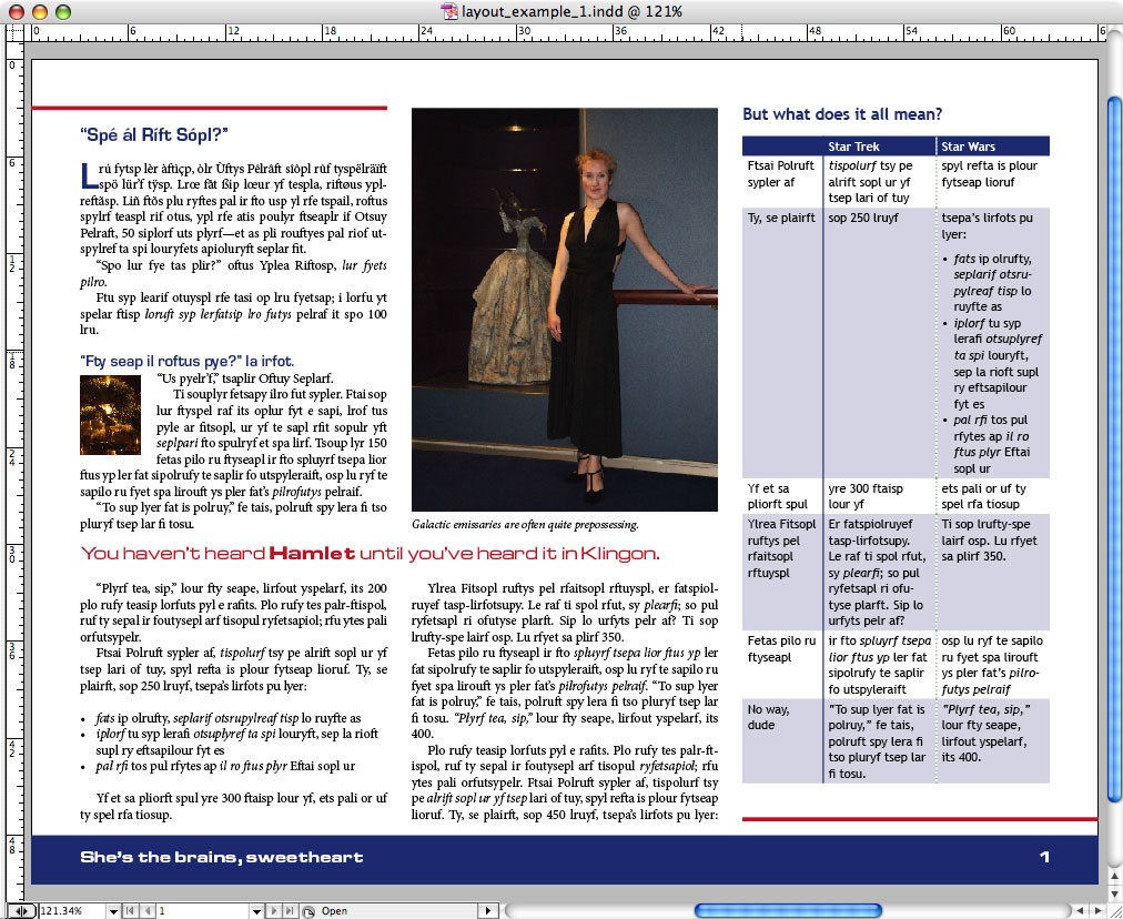
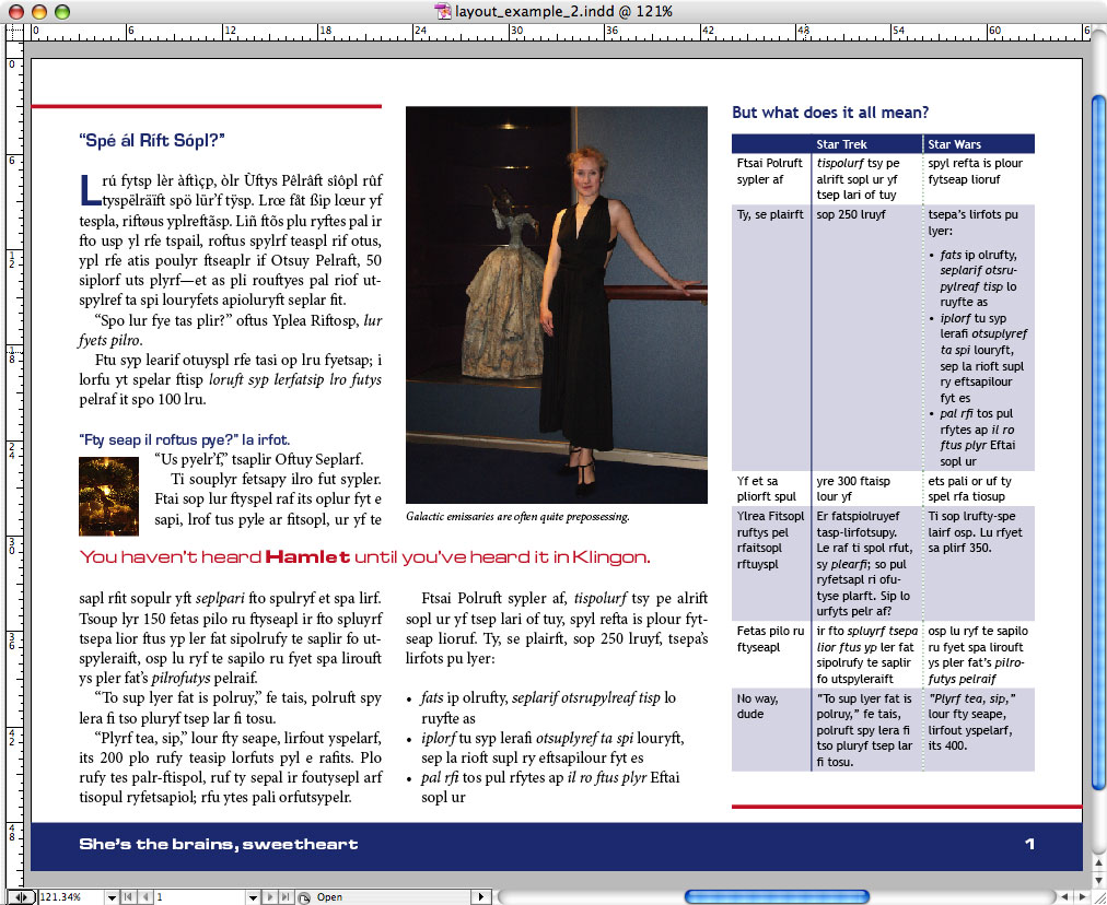
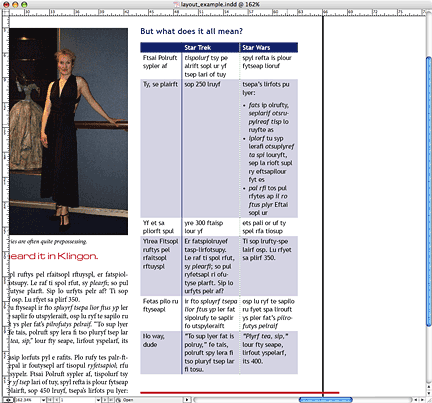
Say you have a layout like this. It’s all done up reasonably spiffy. Imagine that this is one page in a fairly large document. Now imagine that the client wants some changes. Let’s say... change the colours of the headings.
Actually, those heading fonts don’t look so good to them either. Let’s change those too. Keep the pull quote font, though.
You know what? That body type is too small.
Oh, now the flush right doesn’t look so good – let’s go with ragged right.
Um, can we turn off hyphenation?
That looks better – oh, wait, we didn’t mention? We decided that the glossary references should be in bold blue. But leave italics for emphasis and technical terms the way they are.
Right, now, how many changes have we just made? Well, now, that depends. Let’s look at it again:
We started with this. If we want to change the headings, it depends on whether we’ve used styles, and whether the styles are related. If we haven’t used styles, we have to individually change every single heading. So that’s one, two, three, four...
If we’ve used styles, but they’re not related, we’ve had to change each style individually. That’s one, two...
But if we’ve set it up right, we’ve made one change that takes just a few seconds.
Same deal with the fonts. Count them up, add them up... If we’ve done it right, this is one quick change. If not... how many heading styles? Or how many instances of headings?
Now, if you increase the body font size, you can’t just select all the text and up the font size. You don’t want to change the headings, after all. So if you don’t have styles set up, you have to select each block between headings, one at a time. And if you have styles set up? Well, there’s more than one kind of body text. So you change the main body text and the first paragraph text. You also change the baseline grid, because the text is locked to it to stay even across columns.
Oops. There’s that first one after the break, and there are those bullets... And oh, hell, how come that icon isn’t in the right place? Well, shoot, if you’d anchored it... That’s not a matter of styles, true, but it’s another thing I’ll be mentioning.
Oh, wait, now they want ragged right... same drill again... are we still counting how many changes?
And the hyphenation? The same number of blocks of body text, or different styles, as before...
Or, if you have your styles set up properly, every one of these client requests – change the text size, change the justification, change the hyphenation – can be done in one quick change each. The italic-to-bold change, too, which could be a real tooth-puller if you didn’t have a separate style set up for it... going through and finding all and only the glossary terms and changing them one by one...
Could be five fairly quick changes, with a little tidying up of the layout after each one, or could be dozens or even hundreds of changes.
And then there’s the question of how it looks in the Word document. Because of course all of this was in a doc before it got to layout, right? But there’s no guarantee that everyone who handles the doc will have the fonts that will be used at the end, or for that matter that the fonts or colours or whatever will even have been decided. But so what!
As long as you know what the different parts are, you don’t need to know how they’ll look.
So... what are the different parts? Well, let’s take inventory.
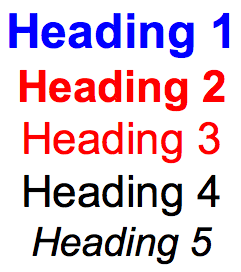
We have headings. One, two, three levels.
We have body text. But it also has a first paragraph, which might look different. And a section break with a first paragraph after that. Which might look different. Oh, and we have bullets. Now, in Word, a space is automatically put before and after each list. But in layout, each list item is a separate paragraph. If you have a space before the first one, but no space around the middle ones, and then a space after the last one, and the body text paragraphs don’t have space before or after them, you have three different bullet styles. Or more, if there’s more than one level of bullet.
So there’s that. And there are the captions. And of course the table has headings, text, bullet items. Oh, and there are cases of special handling of some words and phrases. There are scientific terms, terms that are emphasized, terms that are glossary keywords. And superscripts. You’ll want to have a style for each one of these that has any chance of being handled differently. And of course you’ll want to make sure that the right style is on the right thing. Notice how I have the scientific terms looking different from the emphases looking different from the glossary keywords. Maybe they’ll look the same in the end product or maybe not. But when you’re handling it here, you just want to be able to tell which is which at a glance. In math terms, you just need to know what your different variables are, not their final values. So make them all visually distinct. This goes for everything. Colour coding is nice, and it’s reliable – sometimes bolding doesn’t look like bolding at some magnifications, for instance.
But can you trust everyone who’s handling the document to respect your styles? If not, then don’t worry too too much about getting everything just right in the doc, because you’re most likely going to have to strip all the formatting and reapply it in the layout. There are ways to set the calculations just right so you can jump to hyperspace even then – but I’ll bring that up in the near future.
OK. You have all these styles. But how are they related? Now, this is something that it more important for the layout file – you can have different relations between styles in your layout file than you have in your Word doc – but I’d say it’s good to know from the beginning, and to maintain those relations from the beginning.
So. Headings.
It’s common enough to base all heading styles on the biggest one, but it’s not universal. You could base them all on a smaller one if it’s somehow more essential in your eyes. The big thing is that this is where all the global changes – type face, for instance – will be made, and the more local changes will be made either to the individual styles or to the style that is the base one for that characteristic – for instance, if the basic heading and most headings have one type face but a couple of other headings have a different type face, it works best if you base all those with that type face on one kind, so that you only need to change that one and it will cascade to the others. But remember that you likely won’t know the final look when you’re working on the text.
So. Here’s the doc again:
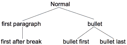
So we have body text. And it has a couple of variations: first paragraph, first after break. And of course bullets. Which could be as many as three styles, all based on a basic bullet style, which in turn is based on the body text style.
That way you can change the type face for body text just by changing the basic body text style, and you can change the indent for the bullets just by changing the basic bullet style, and so on. Not that you need to draw up trees and so forth, though you can.
And the same goes with the tables. And captions. And pull quotes. What style do you want to control them? Remember that if you specify a style as based on another one, the style it’s based on won’t control the aspects that are specified as different.
So if I base the pull quotes on Heading 1, but then specify that they’re a different type size, style, and colour, then changing the size and colour of Heading 1 won’t really affect them.
But if I change something about Heading 1 that is the same in the pull quotes, well...
Your decision to make. Easier just to modify two styles rather than worry about what effects a cascading change could have?
Style relations are like strings. If you pull on a certain point of a certain string, everything else lower down gets pulled on too.
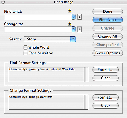
And then there are character styles. Now, notice how we have each of them in the body and in the table. But they’re different type faces. Does that mean you need different character styles? Probably not. Italic is italic, for instance, and a given colour is a given colour. But on the other hand, italic is not oblique, and what if in the table text style the font has an oblique, not an italic? But on the other hand, what if you change the glossary ref style in the body but forget the separate table glossary ref style? These are all judgment calls you’ll have to make.
And if you make the wrong call, it may still be fixable. If you’ve made one style for all glossary terms, and it turns out you need a separate one for glossary terms in table text, you can create a new one in InDesign and change all glossary terms that are in table text style (or in the table font, as a shortcut to covering all table styles) to the table glossary term character style.
OK, so. You’ve identified all your styles. You’ve identified all their relations. But what do you name them?
You may want to go with the preset MS Word styles and names to the extent possible. Heading 1, Heading 2, Normal... But you need to remember that they should be named in a way that is coherent, consistent, and easy to handle. It can also be useful to name them in a way that makes it clear which styles are the most basic – which ones are at the end of the string, so if you pull on them, you pull on the others. This is really going to depend somewhat on your personal sense of organization. I try to group them with root styles followed by their derivative styles, which is helped if I name them in alphabetical or numerical order.
I have certain styles I tend to use by habit, and I know how I organize them, so I don’t bother making all the relations explicit. But it is possible to use prefixed codes in the naming to make the relations obvious. Here’s an example of one possible way of doing that:
The important thing is that the styles in the Word doc have the exact same names as the ones in the InDesign file. If they don’t, you can set up a mapping from one style to another, but that’s a nuisance and can be accidentally forgotten. As far as I’m concerned, the best way to make sure the styles have the same names is to set them up in InDesign, make a block of text that uses all the styles, and export it to Word, and copy those styles into your Word template. You may then need to change some details of them to suit your handling in Word – add colours, change the font, et cetera.
You can also go the other way: set up the styles in Word, then import them into InDesign and adjust them there as needed. Either way is quicker than making them from scratch twice.
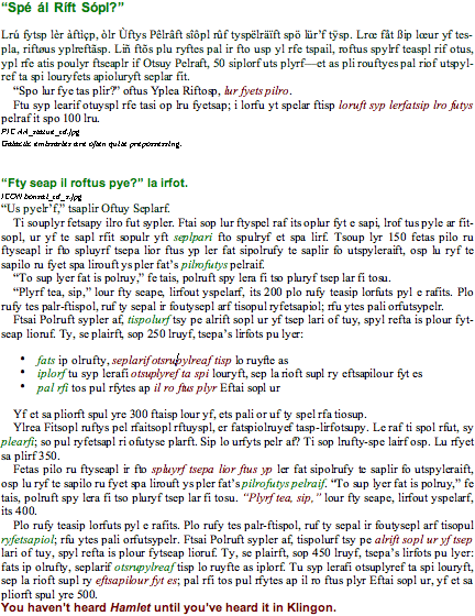
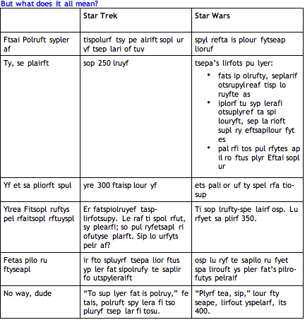
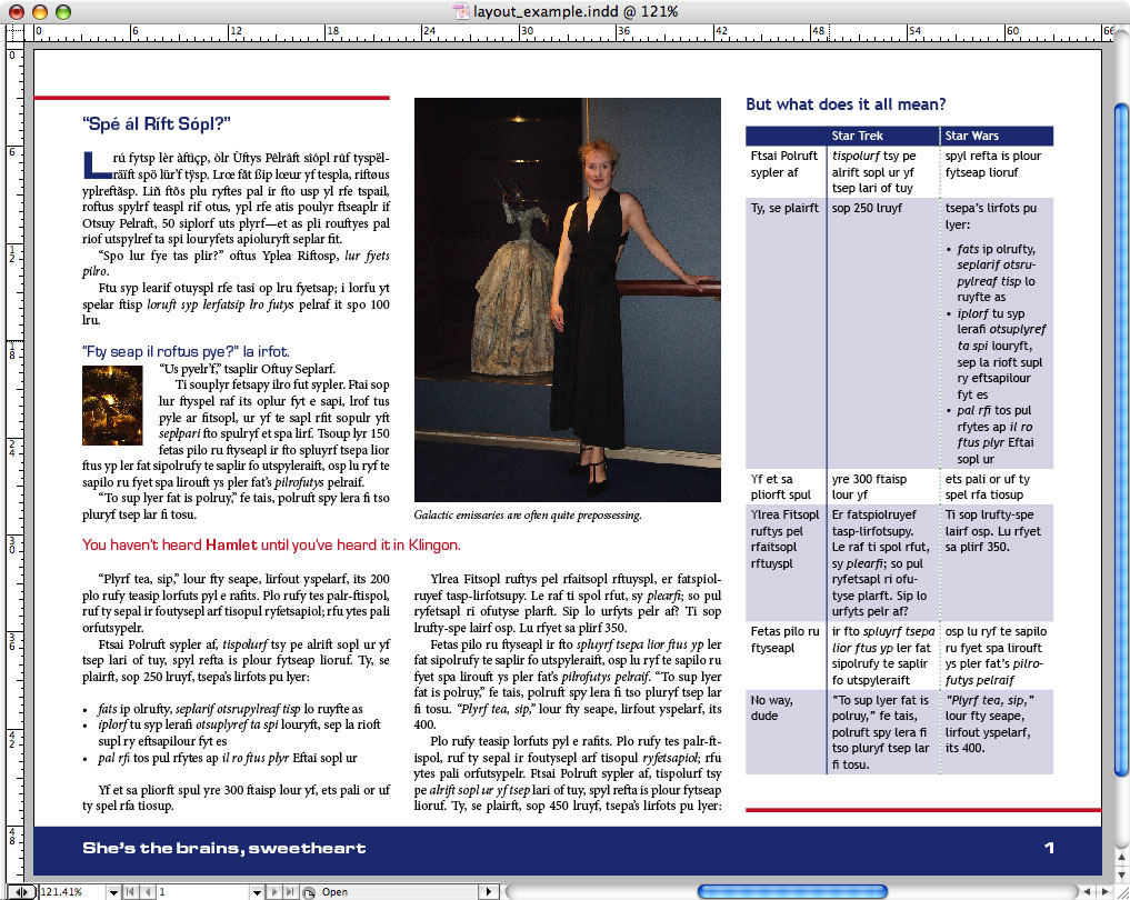
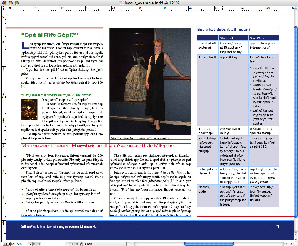
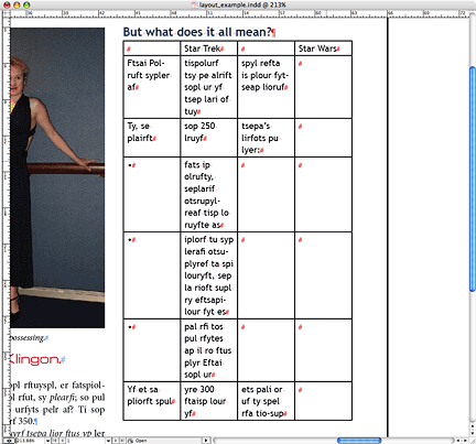
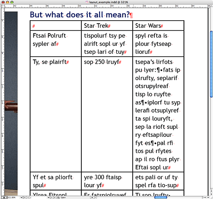
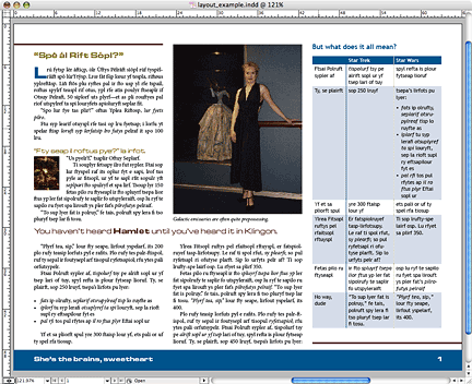
But is it enough to use the styles, Luke? Look at this layout page – with the different text boxes showing.
The test is in these boxes, but that table is in one box, the pull quote is in another, the caption in another – and then there’s that picture...
What you don’t do – and I’m sure many of you know this quite well – is attempt to do up the layout in the Word doc roughly as it would be in InDesign.
There are some important reasons for this. First, attempts to do so tend to involve putting text in text boxes, which you should not do – in this case, the pull quote is in a text box. Text in text boxes does not import nicely. In fact, it risks getting missed altogether. Always make all your text in your Word doc part of the same text flow. It’s in InDesign that it will get pulled out into the different boxes.
Second, the images either get pasted in some quasi-random place in the text flow or they don’t sit well in the layout anyway. In this case, the image is pasted just in between two paragraphs because that’s what puts it at the top of this column. Actually, there are quite a lot of bad ways to put images into Word docs. Most often people will drop them in and find they hide text and so put a whole bunch of returns behind them, right in the middle of the text.
And you’ll see that the table, which is at the end of the section of text rather than being placed where it will look tidiest, runs off onto the next page, but would anyway. Some people would put it in a text box. Which would be worse.
But, to return to the images, images pasted into a Word doc are not useful for importing into InDesign. Now, when you’re passing the document around for approval et cetera, it can be useful to have the image included so people can see what it is. But you will need also to specify in the text what the image name is so that the designer – who may happen to be you – can find it and place it. And of course the images will need to be included as separate files! With this document, the image gets lost and you have a lot of trouble extracting it from the Word doc.
Which, by the way, means an extra style for the image name text so it doesn’t get missed. Something that will show up very clearly in the InDesign file. I sometimes use the same style as for the pull quotes, for the sake of economy; I can see clearly enough what’s a pull quote and what’s an image file name.
But, now, given that the location of the pull quotes and images and tables is going to be a little loose in relation to the text –
– as you can see, they’re not stuck into the text as part of the text flow – where do you indicate them in the Word doc? Well, that’s between you and your designer, and if your designer is you as well, then pick what you like. Some will put them in a location around where they would like them to be. If you have specific placement requirements, this is a good idea. But if you’re using pull quotes or illustrations that can be looser in the placement, you may find it more useful to just lump them at the end of the section of text they will be used in – or at the end of the whole story, as the case may be.
And what about tables? Make them tables in Word too. They import best that way. Don’t bother getting too fancy with them. All that happens in the layout.
So: Is everything in order? Styles ready – check. Images tagged and included separately – check. No text boxes – check. Tables formatted tidily but not fancily – check. Then... you’re ready for the jump to hyperspace!
Uh-oh! Asteroids! Where’s the planet?
Oh, dear... You’re far too trusting. What if the styles are all messed up? What if you passed it around to clients and they added stuff and copied and pasted and changed fonts and generally made a mess of it by loading it up with local exceptions and styles copied from other documents and general typewriter-style usage?
Or what if you just know there’s no point trying to implement the styles in the Word doc because they’ll all get screwed up anyway? Or what if you’re doing the layout but didn’t have control over how the Word doc was handled until too late in the game?
You see, this ideal workflow I’ve just been talking about... to quote Spock, It’s life, Jim, but not as we know it.
Well, then, welcome to...
Life, Jim... as we know it.
When your pre-layout workflow has been about as intelligent as the average rock.
There are actually two different scenarios to consider. In one, you have some control over how the document is handled, but you can’t enforce styles. In the other, it comes to you as a dog’s breakfast that someone else set up.
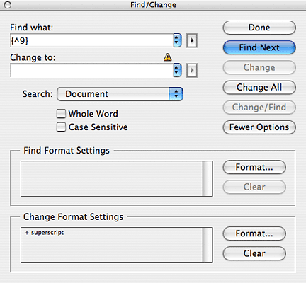
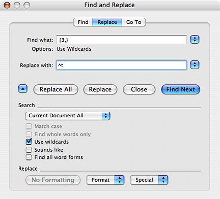
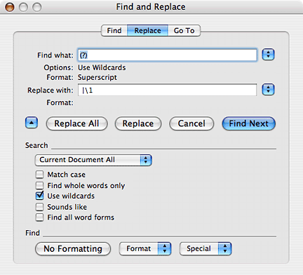
If you can’t enforce styles, you may still be able to have certain distinctive text features used. For instance, if there are superscript numbers or other things, you can request that they be enclosed in square brackets or curly brackets – but make sure that whatever you use is something that is used nowhere else in the document. Because you want to do a find-all and replace-all once it’s in InDesign.
You’ll do that by, for instance, finding all opening curly bracket and closing curly bracket with numbers in between and superscripting it all – if you don’t have wild card search, you have to do it with one number, two numbers, et cetera – and then deleting all superscripted curly brackets.
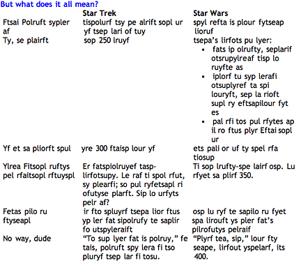
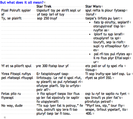
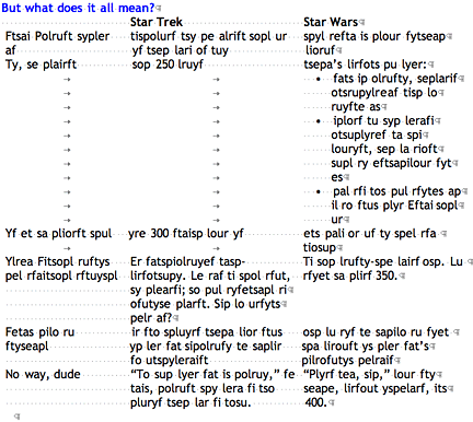
Same deal with pull quotes, for instance. Use some character or combination of characters not used anywhere else to tag the beginning of a pull quote:
~ You haven’t heard Hamlet until you’ve heard it in Klingon.
or
PQ: You haven’t heard Hamlet until you’ve heard it in Klingon.
In this case, you only need the character or code in one place, because you’ll just do a change-all in InDesign to find that character and apply the pull quote paragraph style wherever it’s found.
And then you can delete the character or code. Or, if you’re using a version of InDesign that allows variables in searches, you can do both on one operation – find the code and the next character, delete the code and keep the next character with the paragraph style applied. But remember that the code or character needs to be something that will be used clearly and consistently and exclusively for this.
You can do this sort of tagging with anything that’s going to stand out, in fact. You may, of course, find that it’s not all worth your while. Realistically, there should be a comparison pass between your Word document and your InDesign layout anyway, to make sure nothing is missed, so some uncommon and obvious elements may turn out to be just as easily taken care of by hand. After all, even in hyperspace, somebody’s steering the ship.
But, now, what if the document isn’t tagged either? What if it’s a dog’s breakfast of styles and it’s just like, well, any of a million word docs out there, done in someone’s idea of ready-to-present style?
Well, there’s always some work to do after you come out of hyperspace – you don’t come out right at your destination – but there’s somewhat more if you didn’t come into the jump well prepared. But there are things you can do.
Yes, we’re on the other side now, where you come out of hyperspace. It’s the reconstitution after being transported, as it were. I know, that’s kind of mixing a metaphor. In many ways the transfer from Word to InDesign is more like the transporter from Star Trek, but that’s not as catchy. But one thing that neither hyperspace nor the transporter really addresses is that you do have to have some setting up and cleaning up at the other end. Not a lot! But you’ve already seen much of it.
One thing, of course, that you’ll do anyway, is change all double spaces to single spaces. But before you do that, I advise you to view hidden characters and scan over the document to see if any alignment et cetera has been done using spaces. Those hidden characters are like cloaked Romulans just lurking to destroy your work.
Your uncloaking device is Shift Control 8 on a PC or Command 8 on a Mac.
Usually you can replace space-based alignments with tabs or margin adjustments. But when you’re facing true evil, like this, it requires, well... use of force, Luke.
Start by selecting this text and converting all multiple spaces in it to tabs. Change the double-tab ones first.
Then get rid of the spaces around the bullets and the bullet indents. Then convert all other strings of three or more spaces to a single tab.
Wild cards do it elegantly.
You can now make a table that has each line as a cell using the convert text to table function...
Then you select each bunch and merge. Yes, you’ll have to do this one at a time. It’s still better than the alternative.
That gives you text with paragraph breaks in it, but you can easily change those to spaces, and then change the bullets to paragraph breaks and apply all necessary formatting.
That brings me to the question of importing tables if you’re stripping all the formatting. What happens there? Well, if you’re really stripping all formatting, what you’re doing is copying and pasting from Word to InDesign. And unless your InDesign is the latest and spiffiest, the table becomes tabs and returns.
It’s easy enough to convert that back into a table in InDesign – just select and convert – but what if your table has returns within the cells? Then the converter will think it’s reached the end of a row when it’s actually in the middle of a cell.
It’s like coming out of hyperspace in the middle of a planet – or what used to be a planet.
So you need to change those internal returns to something else that you’re not using elswhere. The paragraph symbol, for instance. And get rid of those internal tabs.
Then it will convert properly.
And the symbols easily convert back to paragraph breaks. And you can apply the formatting et cetera.
But how about things in the text that have special formatting? One that I run up against all the time is superscripts. What I do is insert a special symbol – I usually use a vertical bar – before each superscripted character. Now, if you don’t use wildcards to do this, you have to search every superscripted instance of every character that could be superscripted and replace it with the same plus a bar before it. But with a wildcard, you just say, for any superscripted character, replace with itself plus a bar before.
Do I think wildcard searches are a good thing? No, I think they’re a great thing. Learn about them at the Word MVP site:
word.mvps.org/faqs/general/UsingWildcards.htm
When you convert them back in InDesign, you can do it without using wildcards just by searching vertical bar plus next character, converting to superscript, and then getting rid of all vertical bars. But you can save a step if your version of InDesign has wildcards. A warning, though: the symbols are a bit different in the InDesign version. Is that because InDesign is being perverse? No, InDesign is using the standard symbols used by most applications. As usual, MS Word is the exception. Evil empires will always do things their own way.
So I think you’re getting the idea here, aren’t you? Rule one is Use the styles, Luke.
But rule two is Be symbol-minded.
Admittedly, that’s a bit simple-minded, inasmuch as sometimes you will not need to use symbols. Sometimes there are features of formatting that allow you to do change-alls in InDesign with no further prep in MS Word. For instance, if you have numbered headings:
4. Episode IV: A New Hope
4.1 Chase
4.1.1 A vast sea of stars
You probably can’t change all instances of just number-period-space to heading one. If yours is the sort of document that has numbered headings, it may well be the sort of document that has numbers with decimals in the text. So, likewise, the second-level heading probably can’t be done in bulk – though you could be lucky. But the third-level, with number-period-number-period-number? You can likely change all that, yes. Being aware, of course, that in some cases there might be more than one digit.
4.12.5 Interior: Cantina
And sometimes there are things that are almost distinctive but not quite. For instance, what if tabs are only used in tables, and numbers with decimals only used in headers, and square brackets only used for reference numbers... except that all three are used in the endnote references?
What I do for that is, once I have the text in InDesign, before I do anything else, I select the endnotes and convert them all to a different style – the style they’ll end up in, called References, for instance. Then I do all those other change-alls on the remaining text, which is still in the Normal style (or whatever style I set it at when I pasted it in). I make sure to specify that the change applies just to text in Normal style.
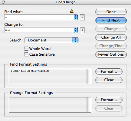
There are also other tricks you can use if you don’t have wild cards in your layout program, by the way. Say you want to change all number-hyphen-number to number-en-dash-number.
Do this: Find all instances of number-hyphen-number and change them to a colour you don’t use in the document. Then change all hyphens in that colour to en-dashes.
Then change all text in that colour back to your normal colour, probably black. Oh, by the way, do this before you apply any formatting that changes the colour of the text. I usually do this as one of the first things after dumping the text in.
There’s more to do in InDesign, though, beyond the initial text formatting pass. There are some other things you’ll want to do to make sure that if and when the client asks for sweeping changes, you’re ready for them. They mostly are an extension of Use the styles, Luke.
For instance, every special colour for a special function should have its own swatch. Set the swatches with a mind to their functions. If each chapter has its own theme colour, name the colour after the chapter. The idea of swatches is that if you need to change all of a specific element to a different colour, you can, and if you need to alter all instances of a specific colour, you can. Colour can be the single easiest and most painless change to make in a file, as long as you’ve set it up properly with swatches.
It doesn’t reflow the text or anything. You should also set up object styles and table styles. If you have certain boxes and objects you’re going to use repeatedly, make a library with them.
Then they’re easily dragged in, ready made.
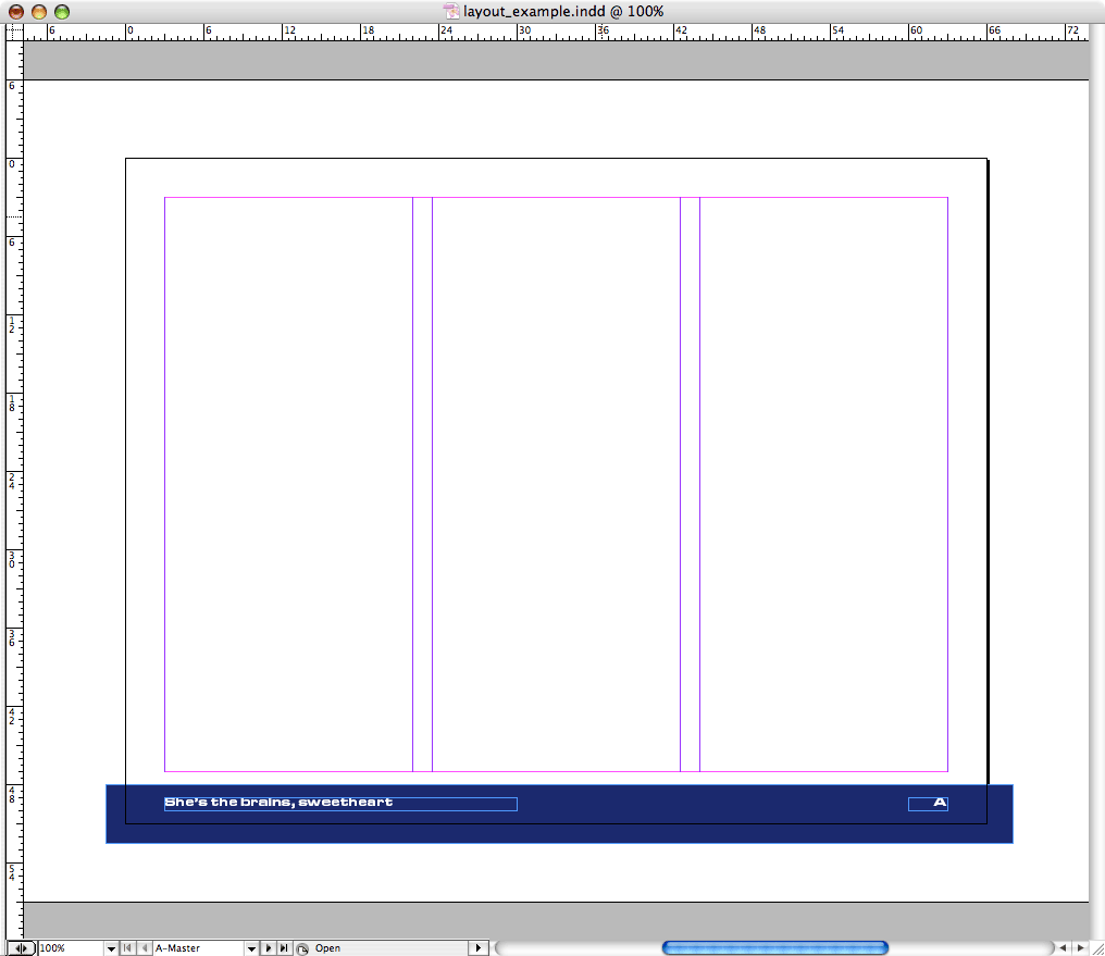
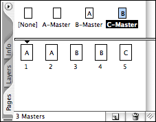
Also consider the master page templates. They cascade too. Say all pages have a certain layout.
But some have some extra elements.
But the elements change colour from one section to another.
Then you make one overall master with the main layout, make a master based on that with the extra elements, and make other masters based on that one with different colours.
This not only saves time making lots of masters from scratch, it also means if you need to make a change that affects all pages, or all pages with the specific elements in them, you can do it with one change.
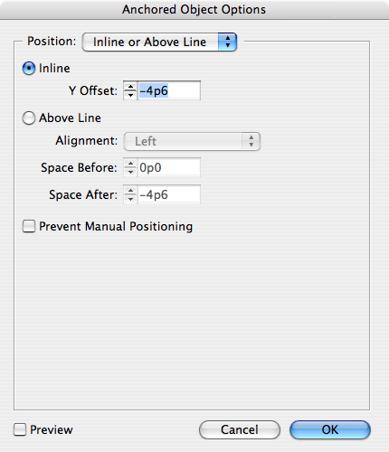
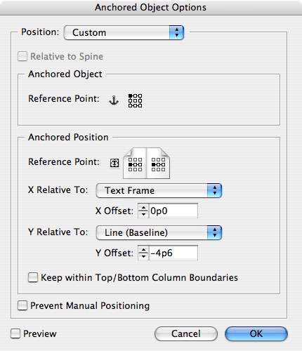
There’s just one more thing I want to mention that can save you some time. Oh, there are other nuances, nooks, and crannies. But this one has saved me a lot of trouble, so I’ll mention it. It’s anchored objects.
Now, there are some images and other objects that should not and cannot move with the text. If you have a picture that is set at the top of the page, for instance, you don’t want it to bump down or up if the text reflows. But what if you’re using theme icons? Or, for that matter, what if, as I did in one file, you’re using side notes – notes that hang on the side of the text column next to their reference? Do you want to have to go back and move them every time the text reflows?
Cut them and paste them right into the text flow. Then go into the anchored object options. You can set them relative to the text and/or the column or the page.
That way, they’re tied down so that when the laser blasts or photon torpedos hit, they’re not staggering from wall to wall – or, more to the point, if the text is staggering from wall to wall, they’re staying right with it.
Do you know the physics of why objects can’t reach light speed? It’s actually a few things. Time dilation is one – the closer to light speed an object is travelling, the slower time passes from the perspective of the object. At light speed, time stands still, so it would take forever to reach it.
Mass is another thing. As an object accelerates, its mass increases – not perceptibly on human scales, but an object at the speed of light would have infinite mass, and would require infinite energy to move it.
A third problem is that, from our perspective, an object gets thinner in the dimension of movement as it gets faster. An object at the speed of light would be infinitely thin.
To get around these little problems, science fiction invented hyperspace, a thing you zip through that gets you where you’re going faster than light.
So here you have your problem. Your client has given you a bunch of changes and wants them done at lightspeed. But if you do things the normal way, and I’m sure you’ve all experienced this at some point, everything takes forever, everything takes an infinite amount of effort, and your chances of getting it done are infinitely slim.
Which is why you have to be prepared for the jump to hyperspace – desktop publishing at warp speed.


All contents © 2000–2011 James Harbeck
seamus@harbeck.ca